Web · Landing page · April 2019
Gartman Mechanical
A website for a mechanical contractor that serves both commercial and residential customers — split-audience tone, one shared homepage, no compromises on either side.
About the company
Gartman Mechanical Services is a mechanical contractor in Oshkosh, Wisconsin — experienced in process manufacturing, HVAC, refrigeration, and plumbing. They serve commercial and residential customers, plus a professional-engineering services line.
Objectives
- Tell the brand's story alongside the services
- Appeal to homeowners and industry buyers
- Showcase the two service families separately
- Immerse the user in the ethos of the services
- Work for two very different audiences on the same homepage
The process
- Research
- Synthesising research and competitor analysis
- Paper prototyping
- Layout design
- Visual design
- User testing and conclusion
01 · Research plan
I needed to learn the market, the users, their needs, and the owner's goals. Building a homepage for two audience types added complexity. I started by talking to the business owner to understand what he wanted from an updated site, then went deeper into the audiences and their online behaviour.
02 · Synthesising research
Two audiences, separate use cases. I worked toward a better view of each side's problems and a clear solution that could hold both under one roof. The competitor sites the owner shared were beautiful — but they didn't help the user reach the service they wanted. I kept that warning visible while still aiming for a simple interface.
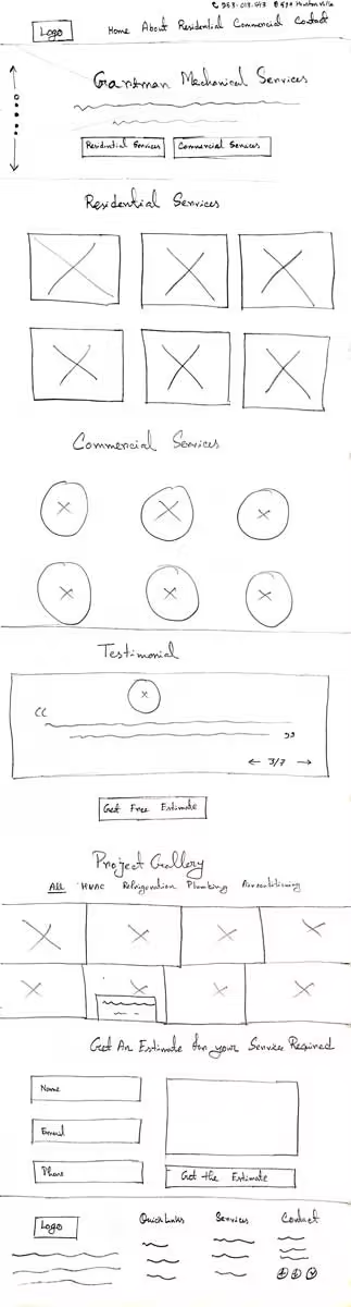
03 · Paper prototyping
Paper-prototype testing is the easiest, fastest, cheapest way to validate a digital product — easy to iterate. I drew layouts that served both audiences and the owner, then collected feedback.
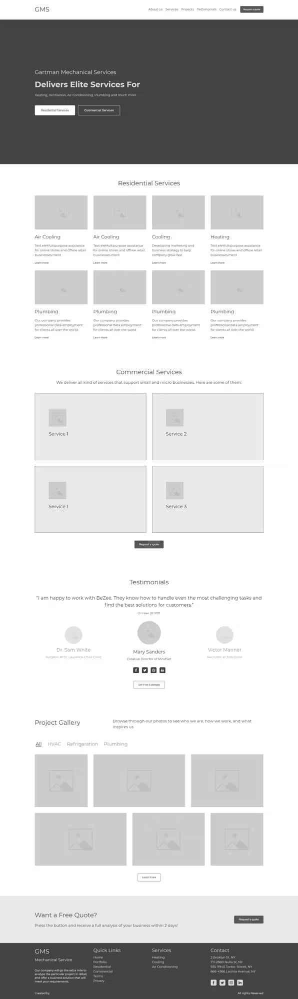
04 · Layout design
After paper, time to go digital. I took the feedback into a mid-fidelity wireframe and adjusted accordingly.
05 · Visual design
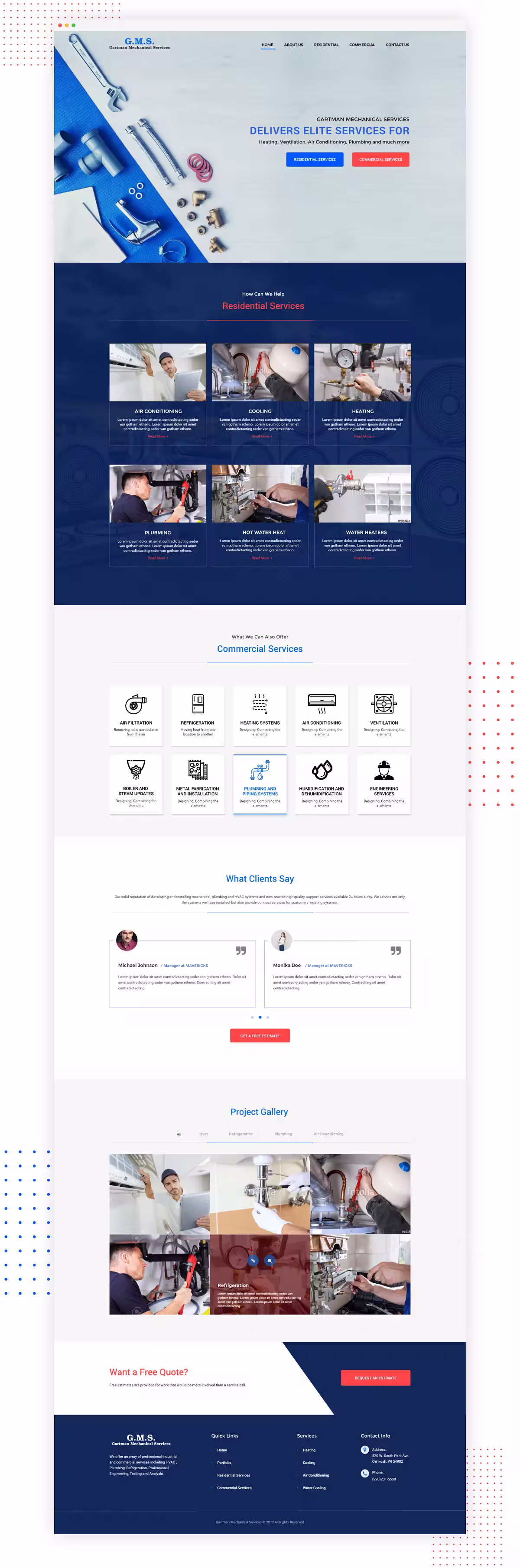
From the feedback and synthesis, time for high-fidelity visual design.
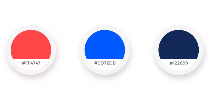
Colour palette
Colourful and industry-appropriate — a warm + cool composition, where red carries excitement and blue carries dependability.
Typography
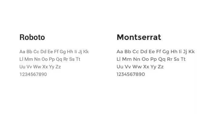
Montserrat + Roboto, using different weights where each was strongest. Typography consistency held across the design.
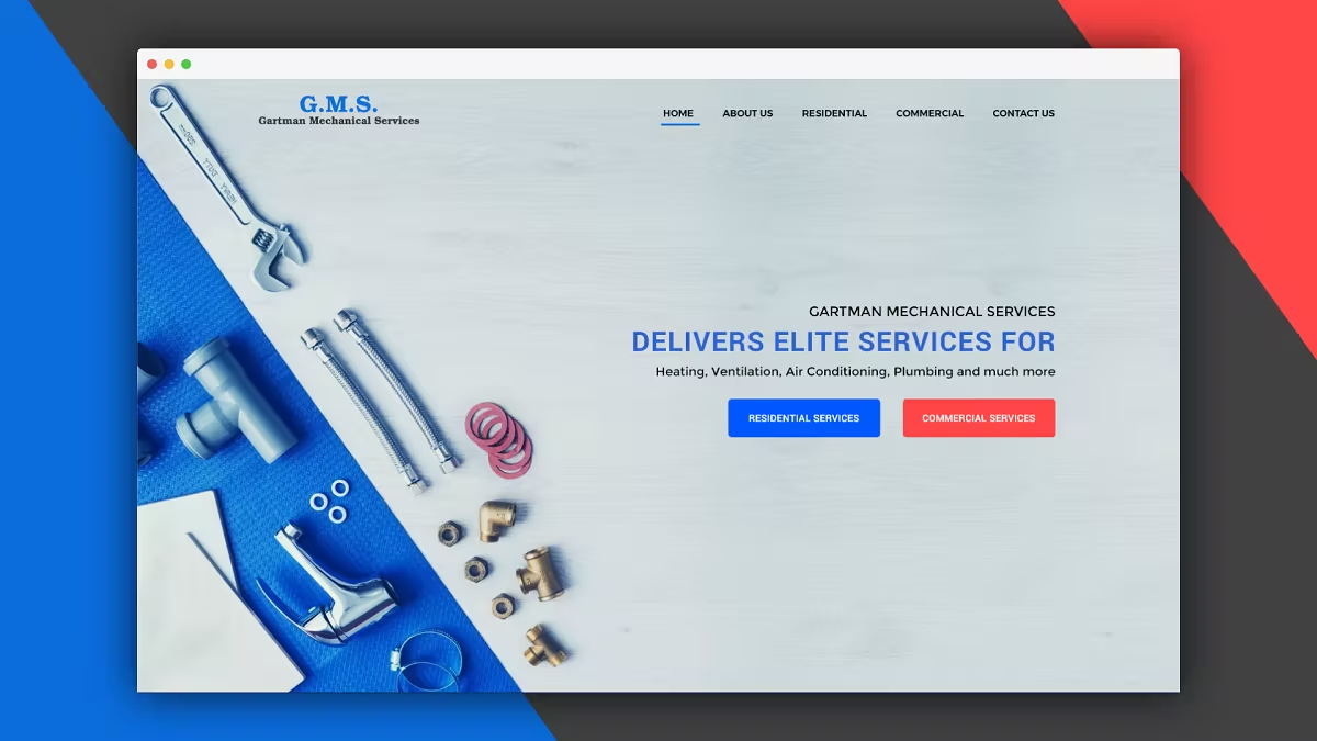
Screens
A landing page sets the perception of a brand at first contact. Colour scheme and typography decisions made here would carry through every other page in the site.
06 · User testing & conclusion
The landing-page design was appreciated by the business owner and is being developed for live testing. Additional page designs are in progress.