Web · Mobile · Telemedicine · January 2019
Get Happy Health
A web and mobile rebrand for a healthcare and biotech company offering online psychiatric care — making appointment scheduling convenient, transparent, and patient-led.
About the company
Get Happy Health is a healthcare and biotech company providing online psychiatrist care right at home. It combines the benefits of telemedicine with technology that lets patients schedule appointments and access care without the friction of traditional referrals. The product is a rebrand from Skypiatrist to Get Happy Health, spanning a website and a mobile app.
The problem
A lot of people need to consult a psychiatrist for mental-health support. The traditional way of scheduling — phone, referrals, paperwork — is boring and time-consuming. Some online services exist, but their time-scheduling flows aren't designed for patients first. We needed a convenient way to book appointments without that friction.
Objectives
- Let users browse psychiatrists and qualifications
- Make scheduling an appointment fast and clear
- Keep registration simple
- Surface psychiatrist credentials to patients
- Quick-access call button
- Allow insurance for payment
- Simple navigation
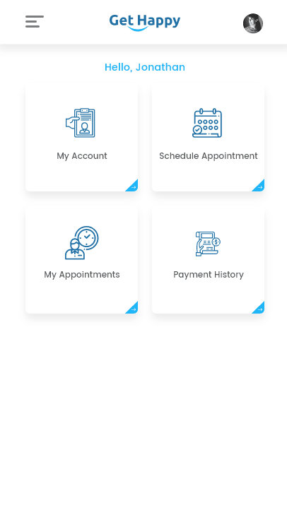
- Show schedule and payment history
- Lift user engagement across mobile and web
The process
- Research
- Synthesising research and competitor analysis
- User flow and user-story mapping
- Layout design
- Visual design
- User testing and conclusion
01 · Research plan
By this point I knew the problem, the user pain points, and the goals. Empathy first — understanding the audience's feelings and needs. The signal: users want the most useful information on the home page and clear navigation. I learned how patients search for services online.
02 · Synthesising research
From audience research and reference sites, I found what was missing — and how to add value for this brand. People are triggered when offered an instant solution with a clear call to action. They don't want a long list of benefits. They want to book an appointment now.
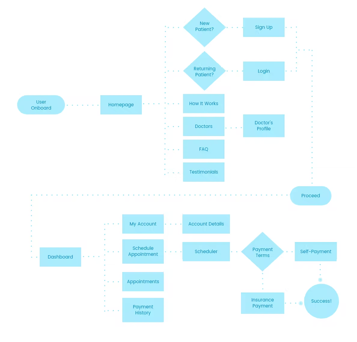
03 · User flow & story mapping
Following the user stories, I mapped the journey of a patient from onboarding through to scheduling an appointment.
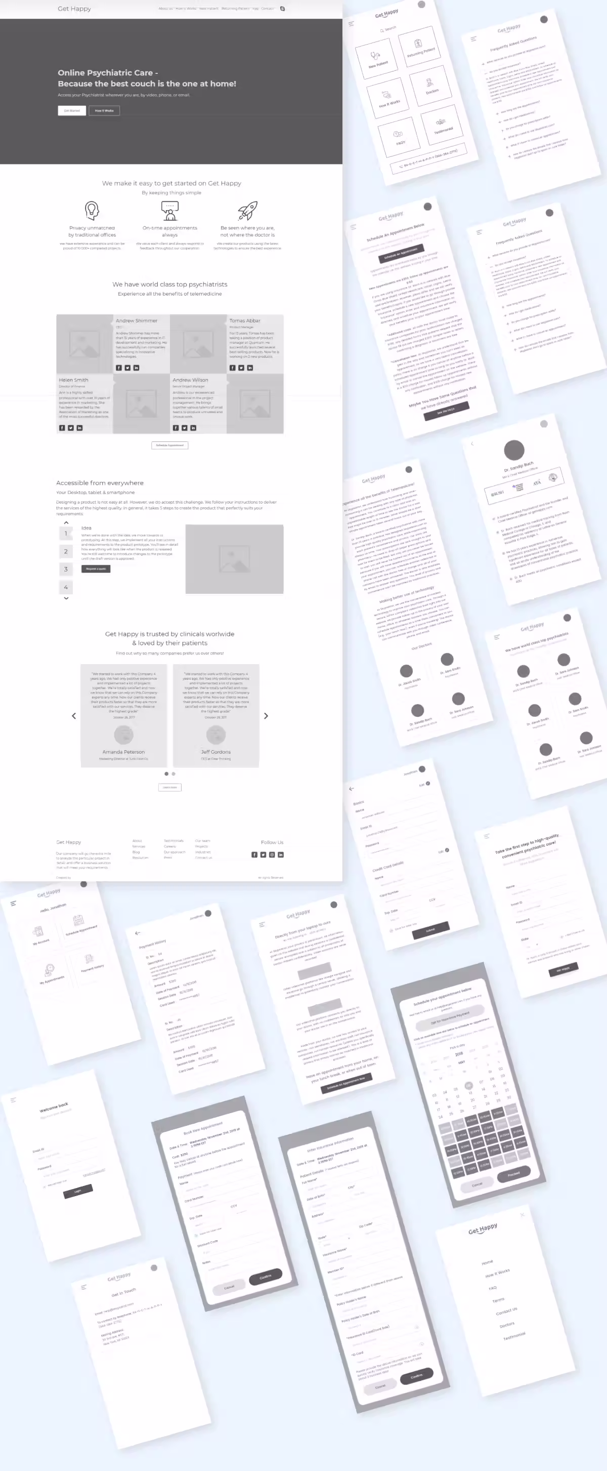
04 · Wireframing & prototyping
Before the design stage, I built hi-fi wireframes — a way to check the whole flow and run usability testing without writing production code.
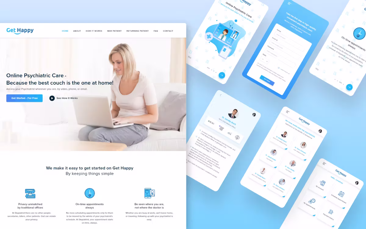
05 · Visual design
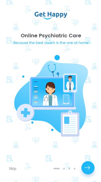
After the paper prototype and hi-fi wireframes, time to go fully digital. I took the features I was most excited about and rendered them at high fidelity — finalising interactions and user flows.
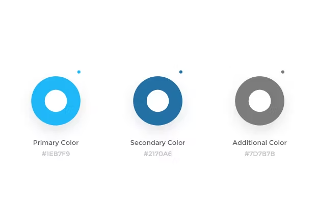
Colour palette
I picked a palette warm and friendly to someone seeking psychiatric care — calming, approachable, never clinical.
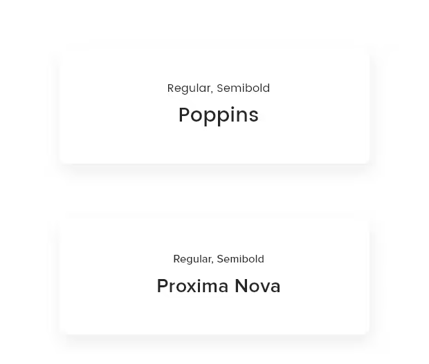
Typography
Minimum number of typefaces — a clean, geometric face that matched the brand. Typography consistency held across the design.

06 · User testing & conclusion
I guerrilla-tested the prototype on five people — running a scenario the client and I built together, similar to a real patient seeking online psychiatric care. Users moved through the flow easily and called out the speed of the appointment-booking step as the strongest signal. With more time, I'd extend the test pool and instrument the live site for behaviour analytics.