Mobile · iOS · Android · August 2018
iMenu — food ordering
A small mobile app aimed at solving a few simple problems in the food industry — bringing nearby cafes, restaurants, and food trucks under one menu so a food lover can order their favourite dish in fewer taps.
The problem
Cafes and restaurants each have their own website. Hunting across them for a favourite dish is a chore. The client wanted an app that worked in as few taps as possible — every basic flow on one screen, no excessive scrolling, fitting any phone screen size.
Objectives
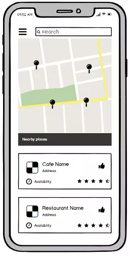
- Search restaurants and cafes by location
- Feature the best available foods
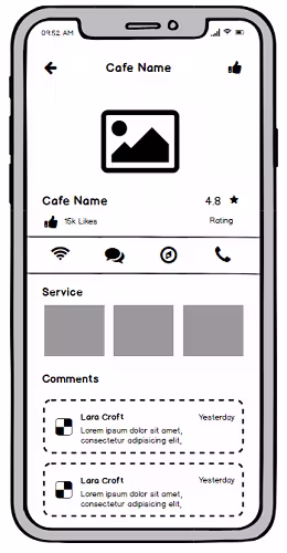
- Show restaurant details clearly
- Display customer reviews and ratings
- Call or chat with the manager
- Organise foods by social vote
- Use colours that drive appetite
- Keep navigation simple throughout
The process
- Research
- Synthesising research and competitor analysis
- Paper prototyping
- Layout design
- Visual design
- User testing and conclusion
01 · Research plan
By this point I knew the problem, the audience, and the goals. During empathy work I learned that users buy when they see social proof — and I picked up the techniques that drive customers to buy. The core mission: order food in as few taps as possible.
02 · Synthesising research
Across the audience and similar apps, the pattern was clear: people don't want to browse a huge restaurant-style menu in-app. They want their favourites surfaced. Showing featured / favourite foods on each merchant page would carry more weight than a full menu dump.
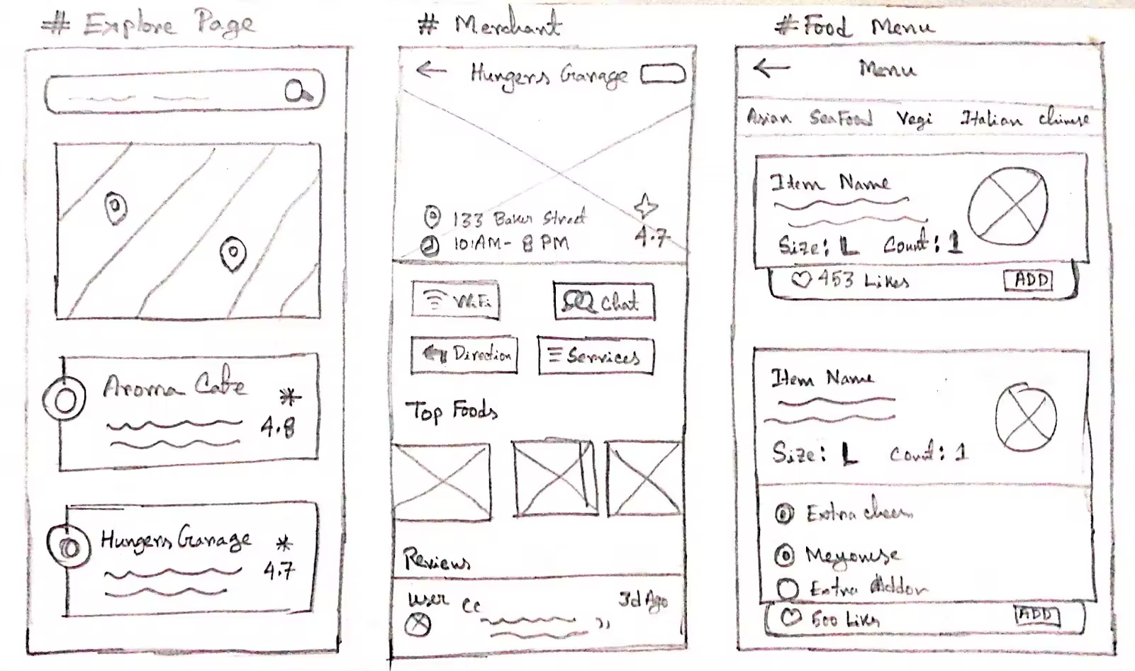
03 · Paper prototyping
Pen-and-paper first — fastest and cheapest way to iterate. I sketched as many ideas as came to mind, analysed them, and pulled out the key concept.
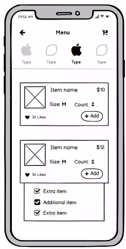
04 · Layout design
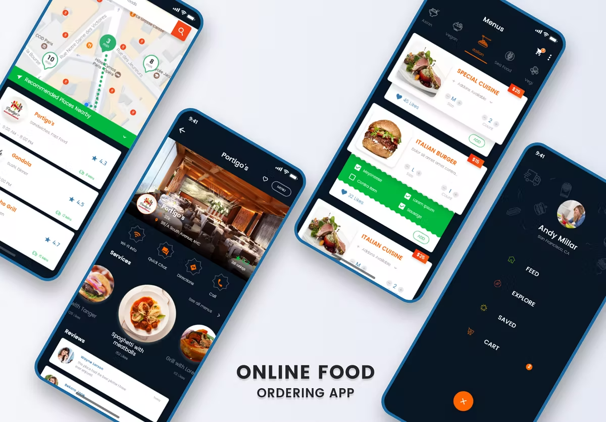
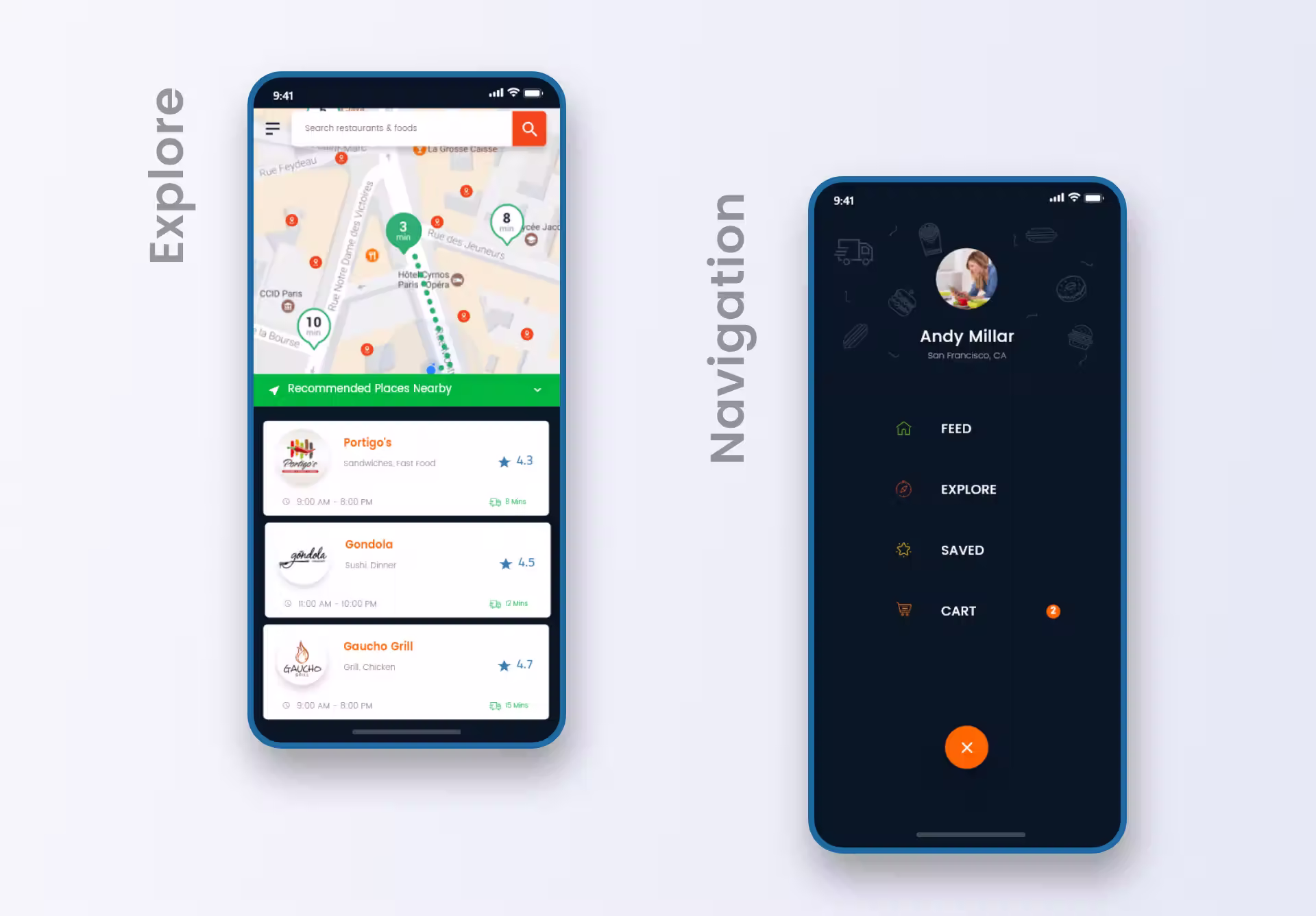
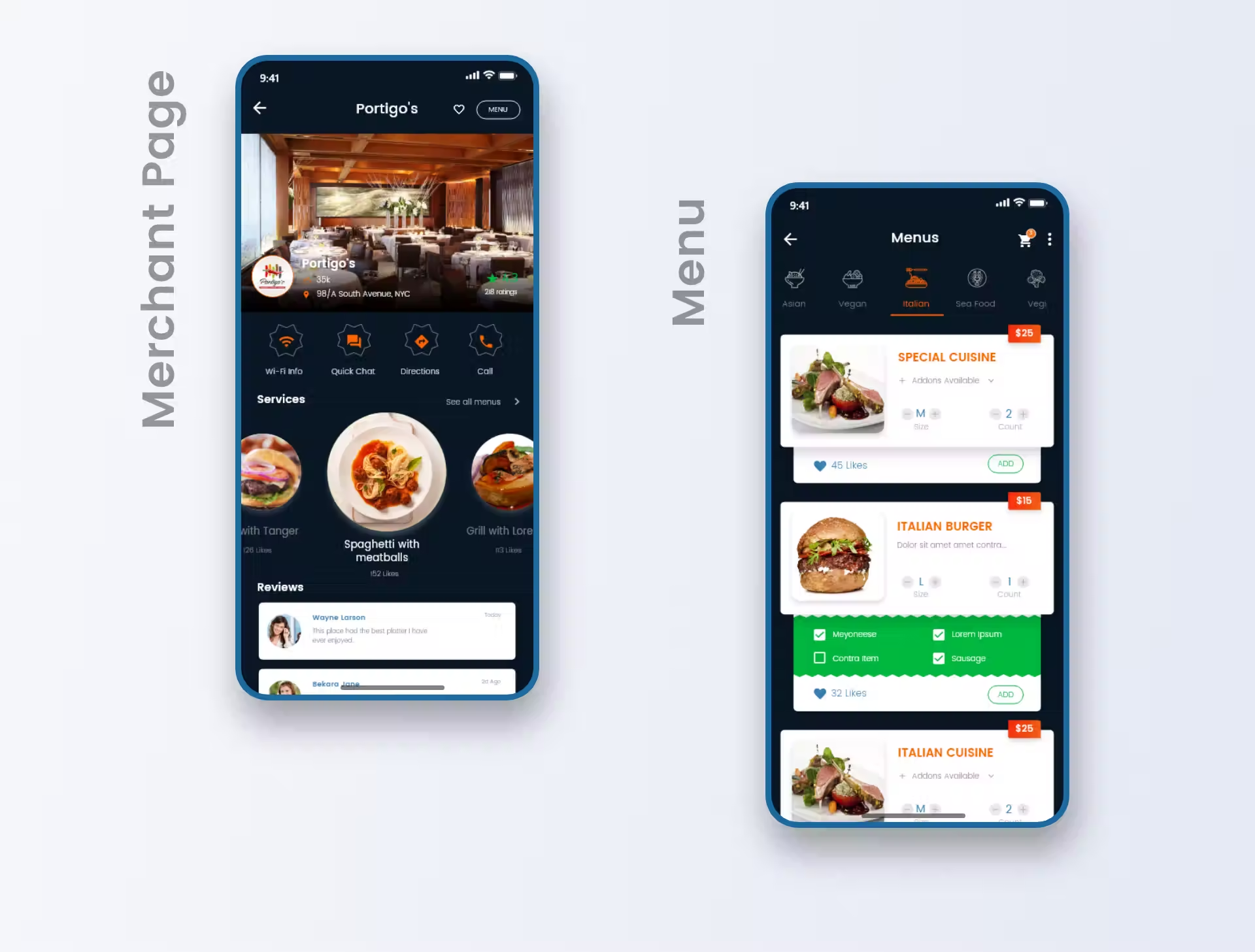
The client emphasised three screens:
- Explore. After sign-up, users land here. Recommendations based on location, prior rating, and distance.
- Merchant. From explore or search, the merchant page surfaces popular foods and ratings — order entry starts here.
- Menu list. Browse the full menu when needed. Add-ons via single-tap radio-style buttons.
05 · Visual design
From the feedback and synthesis, I moved to high-fidelity prototype design — a simulation of the final product. Prototypes test ideas cheaply before investing engineering time. Static screens built in Adobe XD, strung into a clickable prototype with realistic transitions and scroll.
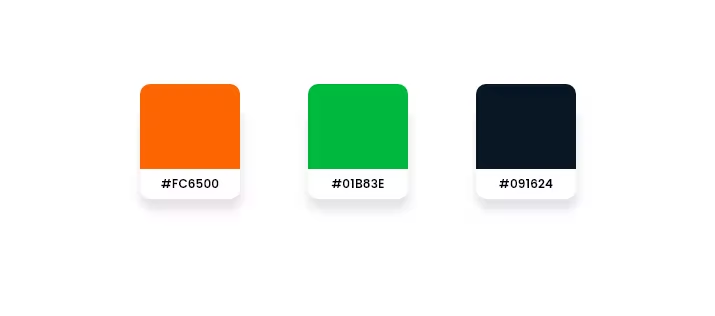
Colour palette
The brief was simple: appeal to users and make them hungry. I researched the food industry, tested several palettes in the primary design, and settled on three.
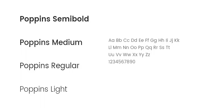
Typography
Poppins throughout, mostly lighter weights. Typography consistency held across the whole app.
06 · User testing & conclusion
I guerrilla-tested the prototype on five people, running a scenario where they searched for a nearby restaurant and placed an order. The business owner helped run the test. People liked how the foods were sorted and how the ordering flow held together — encouraging signal.